
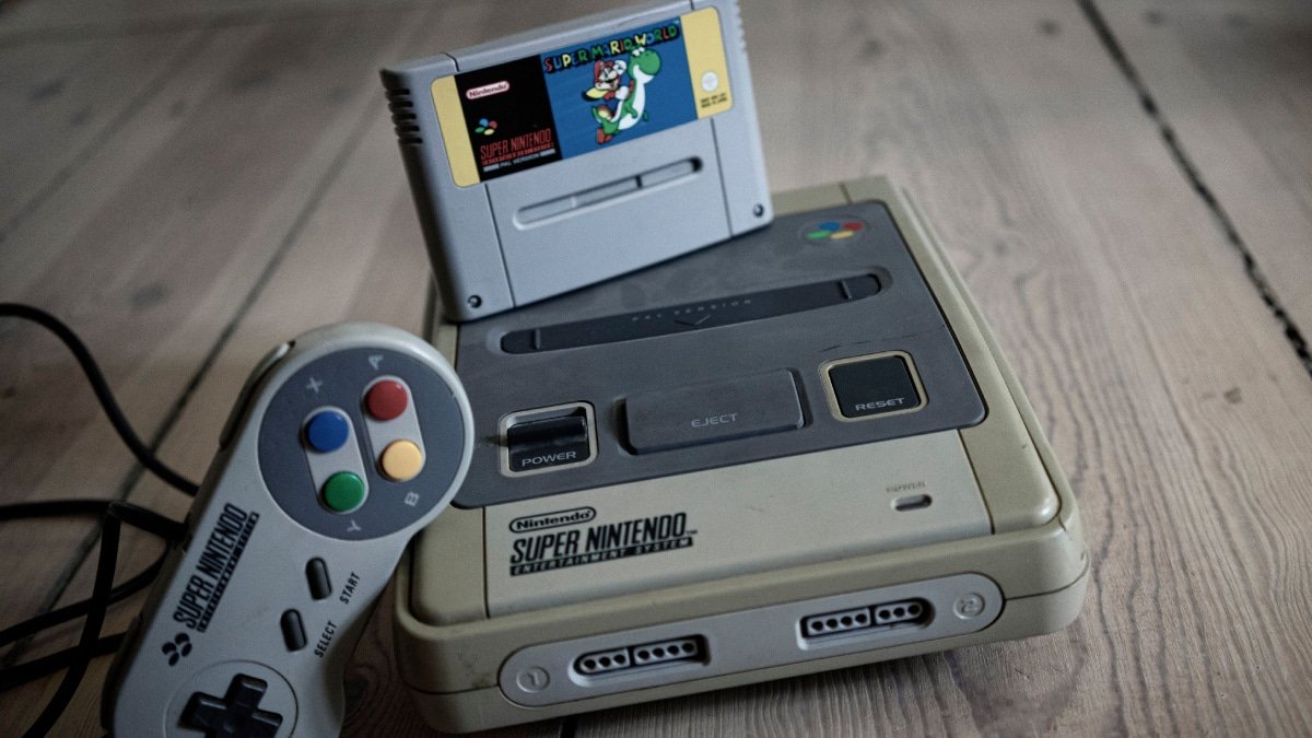
A closer look at the technology, artistry, and display quirks behind an enduring 16-bit style
Super Nintendo graphics still look good because the system’s limitations gave artists a clear visual framework. Small sprites, tile-based backgrounds, restricted palettes, and low display resolutions demanded careful choices. Artists could not hide weak composition beneath dense textures or cinematic lighting. Every color, outline, shadow, and animation frame had to earn its place.
The hardware also arrived at a useful moment. It offered substantially richer color and layering options than earlier 8-bit consoles, yet it remained rooted in handcrafted 2D art. Add the softening and color blending of CRT televisions, plus effects such as parallax scrolling and Mode 7, and the result was a visual style that felt technically impressive without depending on realism. That balance is a major reason the best SNES games still hold up today.
Table of Contents
Limitations gave SNES art focus
The Super Nintendo could do far more than the NES, but its artists still worked inside a tightly controlled box. Graphics were assembled from reusable tiles, sprites shared limited palette resources, and video memory placed firm limits on what could appear at once. Those restrictions encouraged teams to plan scenes with unusual discipline.
You can see that discipline in Super Mario World. Mario’s shape is readable in motion, enemies use unmistakable silhouettes, and the scenery is detailed without competing with the action. The Legend of Zelda: A Link to the Past takes a similar approach. Floors, walls, doors, characters, and interactive objects remain easy to identify even in busy dungeons.
The SNES did not make beautiful images automatically. Its hardware provided tools, but artists still had to decide which details mattered and which could be removed. The strongest games look intentional because almost nothing feels accidental.
Why Super Nintendo graphics use color so well
The console gave developers access to a broad color space and could display far more colors at once than Nintendo’s earlier home system. That did not eliminate constraints. Colors still had to be organized into palettes, and individual tiles or sprites often worked with only a small subset of the available range.
Instead of treating that as a problem, artists built compact color ramps. A character might use a base color, one shadow, one highlight, and a darker outline. Small shifts in hue suggested metal, skin, stone, foliage, or fabric. Contrast kept important characters separated from the scenery, while repeated colors tied a location together.
Final Fantasy VI is especially good at using limited color to establish mood. Its towns, machinery, caves, and battle backgrounds feel distinct even when they reuse visual components. Chrono Trigger often goes brighter, with clean character designs and environments that change dramatically from one era to another. In both cases, the palette supports the story instead of simply showing off the hardware.
Pixel art rewards clear decisions
Good 16-bit pixel art is visual shorthand. At low resolution, a few pixels can define an eyebrow, a piece of armor, or the edge of a platform. Move one cluster and the whole image can feel different.
That economy gives classic pixel art much of its appeal. Strong silhouettes make characters recognizable before the viewer notices individual details. Carefully placed highlights suggest volume. Texture appears through small repeating patterns, while selective outlines separate objects without making everything look like a sticker.
Super Metroid is a great example. Samus reads clearly against caves, laboratories, lava, and organic environments, yet her sprite still carries plenty of mechanical detail. The backgrounds feel dense and atmospheric, but navigable surfaces remain understandable. The game looks rich because the artists controlled detail rather than filling every space with noise.
CRT televisions completed the picture
Original SNES games were usually viewed on CRT televisions, not on fixed-pixel digital panels. A CRT produced an image with scanlines, phosphor glow, slight softness, and some degree of color blending. The exact result depended on the television and connection, but it was never identical to the razor-sharp grid shown by a modern emulator at high magnification.
That difference matters. Alternating pixels could blend into an apparent intermediate color. Dithered shadows could look smoother. Hard stair-step edges became less obvious, and bright areas gained a subtle glow. The screen was effectively part of the rendering process.
This does not mean every SNES artist designed each pixel around one specific television. Home sets varied too much for that. Still, developers worked in a world where CRT output was the normal viewing condition. Their art was judged, revised, and approved on displays that softened the source image. Raw pixels on an LCD can therefore look more severe than the image players remember.
Richer hardware expanded the canvas
Compared with the NES era, the SNES gave artists more colors, more flexible background modes, larger and more varied sprites, and useful tools for combining layers. Those improvements allowed subtler shading, denser environments, and more elaborate effects while preserving the readability of 2D art.
The hardware supported different visual identities. Super Mario World uses bright, economical shapes. Super Metroid favors moody biomechanical spaces. Yoshi’s Island imitates crayons, markers, and children’s illustration. Donkey Kong Country uses sprites derived from pre-rendered 3D models. None of these looks represents the entire system, which is the point. The hardware was flexible enough to support memorable styles.
Specifications created possibilities, not taste. A large palette can still produce a muddy scene, and more layers can still create clutter. SNES visual design remains impressive when artists used those resources to clarify a game’s world, tone, and movement.
What Mode 7 actually did
Mode 7 is probably the most famous SNES graphics feature, and one of the most frequently misunderstood. It allowed a background layer to be rotated and scaled. By changing that transformation across the screen, developers could make a flat image appear to stretch toward the horizon like a ground plane.
F-Zero uses the technique to turn track maps into fast-moving courses. Super Mario Kart combines a transformed track background with separately drawn racers and objects. Other games use Mode 7 for rotating maps, dramatic transitions, or cinematic camera movement.
Mode 7 was not full 3D rendering. It did not create polygonal worlds, and it did not automatically transform ordinary sprites into three-dimensional objects. It was a specialized 2D background effect. Its power came from how convincingly designers used scaling and rotation to suggest depth, speed, and camera movement. Not every SNES game used it, nor did every game need it.
Movement made the worlds believable
Still screenshots do not capture everything the console did well. Animation gave characters personality, while scrolling effects gave flat scenes a sense of space. Background layers could move at different speeds to create parallax, making distant clouds or mountains seem farther away than the foreground.
Transparency-like effects, color math, palette changes, screen distortion, and carefully timed sprite animation added atmosphere. Super Metroid uses environmental motion and lighting to make Zebes feel alive. Yoshi’s Island stretches, squashes, rotates, and distorts its playful artwork in ways that complement its hand-drawn look.
The best effects serve a larger art direction. They reinforce weather, speed, danger, scale, or emotion. That is why they remain effective after their novelty has faded. A waterfall or heat shimmer still works because it belongs in the scene, not because the player is expected to admire a technical trick in isolation.
Why pixel art outlasted early 3D
Early polygonal console games opened exciting new kinds of spaces, but they often aimed beyond what the hardware could comfortably deliver. Low polygon counts, unstable edges, warped textures, short draw distances, and simple lighting were hard to hide, especially when games attempted realism.
Pixel art made a different bargain. It accepted abstraction from the beginning. A sprite was never expected to resemble a photograph, so players judged it by clarity, character, color, and motion. When those qualities are strong, higher resolutions do not make the original design obsolete.
That does not make 2D inherently superior, and many early 3D games remain beautiful because of strong art direction. The difference is that stylization tends to age gracefully. A deliberate symbol remains a deliberate symbol. An early attempt at realism is more likely to reveal the limits of the technology that produced it.
Modern screens can help or hurt
Playing SNES games today introduces a new variable: scaling. Modern televisions must enlarge a low-resolution signal to fit a much larger fixed-pixel panel. Poor scaling can blur the image, create uneven pixel sizes, or add noticeable input delay. Extremely sharp scaling preserves every source pixel, but it can also expose patterns that once blended naturally on a CRT.
Good upscalers and emulators offer several reasonable approaches. Integer scaling keeps pixel shapes consistent. Light interpolation can soften harsh edges. CRT shaders can simulate scanlines, phosphor masks, glow, and other analog characteristics. The best setting depends on screen size, viewing distance, and personal taste.
There is no single correct way to view SNES graphics. Some players prefer crisp pixels, while others prefer a CRT filter that restores the blended look they remember. What matters is avoiding processing that stretches the image or smears deliberate pixel work.
Art direction mattered most
The SNES arrived with better visual hardware than the NES, but raw capability is only part of the story. Super Nintendo graphics have lasted because skilled teams made thousands of small, connected decisions. They chose readable silhouettes, controlled palettes, expressive animation, and effects that fit each game’s identity.
That is also why Donkey Kong Country should not be treated as the final word on SNES visuals. Its pre-rendered artwork was striking, but it represents one path among many. The painted feel of Final Fantasy VI, the crisp fantasy world of A Link to the Past, the eerie spaces of Super Metroid, and the crayon-like surfaces of Yoshi’s Island are equally important parts of the system’s legacy.
Hardware gave these artists boundaries. Art direction turned those boundaries into style.
Why the look still works
Super Nintendo graphics still look good because they were designed with purpose. Technical limits pushed artists toward clarity, the console’s expanded color and layering options gave them room to experiment, and CRT televisions softened the final image in flattering ways. Features such as Mode 7, parallax scrolling, color effects, and expressive animation added spectacle without replacing solid visual design.
Most of all, these games embraced stylization. They were not trying to disguise pixels. They used pixels as a language, and the best artists became remarkably fluent in it. Modern screens may change the presentation, but they cannot erase the careful choices underneath.
Frequently asked questions
Why do SNES games still look good?
They combine readable pixel art, carefully managed color, expressive animation, and strong art direction. The limitations of the hardware encouraged artists to make each visual element clear and purposeful.
What was Mode 7 on the Super Nintendo?
Mode 7 was a background mode that could rotate and scale a tiled image. Developers often used it to suggest a ground plane for racing tracks, maps, and cinematic effects. It created the impression of depth, but it was not full 3D rendering.
Why does pixel art age better than early 3D graphics?
Pixel art openly embraces abstraction, so its simplified forms feel intentional. Early 3D often pursued realism with limited polygons, textures, and lighting, which made technical compromises more visible as hardware improved.
Did CRT TVs make SNES graphics look different?
Yes. CRT displays introduced scanlines, softness, glow, and analog color blending. These traits could smooth edges and blend dithered patterns that appear sharper on a modern flat-panel display.
Should I use a CRT filter for SNES games?
It is a matter of preference. A good CRT shader can restore scanlines and color blending, while integer scaling offers a crisp view of the original pixel structure. Both can look excellent when configured carefully.